

HEYJUNIOR · 2026
Students weren't missing information. They were checking it three times to be sure.
A campus app redesign that replaced five sources with one reliable view of the day.
Product Designer · Redesign · Research to interactive prototype in 6 weeks · Solo
Project Overview
HeyJunior is a comprehensive mobile app built to improve student life
by combining key academic tools into one easy-to-use platform.
It allows students to organise their coursework and access vital school information from anywhere.
I did end-to-end redesign of HeyJunior, a student utility app for KL University students, using a Lean UX approach. It covers research, participatory interviews, behavioural insights , interaction design, branding, and UI. This product that doesn't just show students their schedule and GPA, but helps them understand their patterns and feel supported instead of overwhelmed or treated as one-size-fits-all.
Key Insights
*I sent out a survey to 11 participants and conducted semi-structured user interviews with 5 participants.
"I DON'T KNOW WHO TO ASK"
Nearly three in four students can't readily find a lecturer's contact details. Reaching the right person means asking classmates causing unasked questions and stalled work.
"I FOUND OUT TOO LATE"
Almost every student misses academic updates at least sometimes. A rescheduled class or a registration deadline reaches them after it mattered, resulting in missed deadlines and eroded trust in the portal.
"I FORGOT TO CHECK"
Updates are published, but nobody sees them. The largest group blames unclear notifications; the next largest simply forgets to open the portal at all.
"JUST PUT ALL IN ONE PLACE"
Students aren't asking for another feature — they want one surface. The top request by a wide margin is an all-in-one dashboard for timetable, attendance and deadlines, delivered by push rather than fetched.


Problem
Despite asking for an all-in-one student app, not one of the students I surveyed was using the one that already exists — defaulting to the college portal or a screenshot on their phone, and treating the friction as normal rather than fixable.
Solution
Keeping the ERP portal as the background source of record whilst designing a user-facing experience that tackles missed updates, the hunt for faculty details and the screenshot that goes stale the moment a class moves.
"How I'd measure success"
NORTH STAR — Weekly Active Students.
Ad revenue is impressions x sessions, so a glance-utility wins on frequency rather than dwell time. The design goal and the revenue goal are the same goal.
No values yet — this is what I'd instrument, not what I measured. Figures arrive once the app ships and runs for 4–8 weeks.
REACH
Installs as % of enrolment.
The actual failure — 1,000 installs is the number to move.
ACTIVATION
% of installs reaching a useful screen in session one.
Removing manual setup attacks the largest funnel drop.
OPERATIONAL
Departmental "where is my class" query volume.
The saving a university would care about — the argument for the partnership.
RETENTION
D7 / D30 return rate.
Distinguishes a habit from a results-week spike.
TRUST
Return rate within 7 days of a data-change notification.
Measures whether the freshness mechanism works.
DESIGN
Turning the home screen from a menu into an answer
The home screen answers before it navigates. Four quick-access tiles carry live values rather than labels — today's class count, current CGPA, events upcoming — so the grid resolves questions without being tapped.

Replacing the screenshot with something that can't go stale
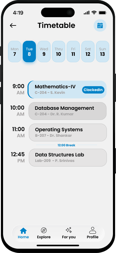
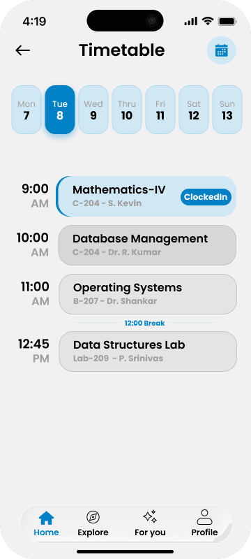
Three of eleven students check their timetable from a screenshot saved in their camera roll, so I designed for the job that screenshot actually does — one instant glance — and gave up the weekly grid the portal already offers: the day is a vertical timeline where the live class is filled in brand blue, finished ones are visibly spent, and nothing has to be entered or re-saved for it to stay true.
Turning a calculator into a record students check on
A calculator becomes a record. The screen opens with the result already computed — SGPA, credits and pass status in a single band — above the subject list with credit weights and grades. The semester selector expands in place to reveal every previous result, so academic history lives inside a control that already existed rather than costing a separate screen.

Turning a directory listing into a way to actually reach someone
Faculty contact details were the single hardest thing to find — eight of eleven students, the strongest signal in the survey — so I built the profile around the question behind the search rather than the search itself, and handed messaging off to the phone instead of building chat into the app.

Making every alert say what changed, and when
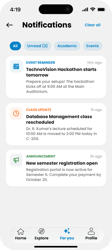
Unclear notifications were the single biggest reason students miss updates — five of eleven — so I rejected the default reverse-chronological feed and typed every alert instead.
Giving students a reason to open the app on an ordinary Tuesday
Campus life lived on WhatsApp groups and notice boards, and three of eleven students ranked internship opportunities as the update they cared about most — so I brought it in-app but kept it strictly time-bound, separate from the place-based.

What looks like a redesign is really a question about why a good app goes unused.
Designed for speed. Built on evidence.
Impact
Elevating product performance through strategic UX
By pairing clear strategy with targeted execution, this initiative directly resolved critical pain points for both
the user and the business.
Led with foundational strategy rather than jumping straight into visual design.
Harmonized user expectations with core business objectives.
Engineered a flexible, scalable system instead of static, one-off mockups.
Proactively solved the underlying problem rather than simply fulfilling the basic requirements.
Projected outcomes
App Sessions: 4 → 8 per month
Task Completion: +35–50%
Support Tickets: –20–30%
Monthly Active Users: 28% → 50%
Reflection
This project strengthened my ability to design against a business model, not just a user need. I gained deeper experience working with public evidence, behavioural segmentation and heuristic evaluation, and learned how a single strategic decision — what a product refuses to do — shapes every screen downstream of it.
Going forward, I want to close the gap between reasoning and proof: moderated testing against the live portal, and an instrumented release that turns the metrics I defined into numbers I can stand behind.